
How to design a billboard people remember: 7 rules
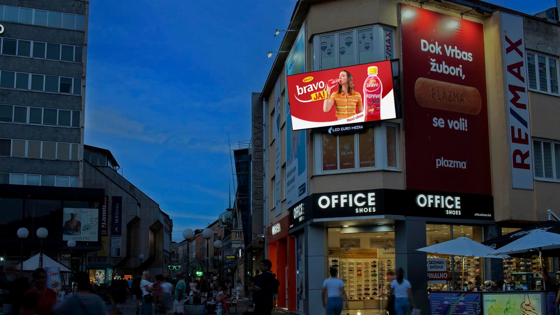
The time a driver or passer-by spends looking at your billboard is extremely short — just a few moments in passing. That is your entire attention budget, which is why design for large formats follows its own rules, different from designing for a screen or a catalogue. Here are the seven that make the biggest difference in practice.
1. Seven words or fewer
The most common mistake: trying to say everything. Nobody reads sentences in passing — they read one message. The general rule is seven words at most. If your message cannot fit into seven words, it is not a billboard message — it belongs on the website your billboard will lead people to.
2. Contrast sells
Industry research shows that high colour contrast improves ad recall by around 38%. Dark letters on a light background (or the reverse), without subtle pastel combinations that blur into one from 50 metres away. A design that looks "too loud" on screen is often exactly right on the street.
3. A typeface readable in passing
- Simple, clean cuts — no handwritten or overly narrow typefaces.
- Mixed case ("Big sale") reads faster than ALL CAPS.
- Generous spacing between letters, words and lines — everything compresses at a distance.
4. One image, one thought
The best billboards have a clear hierarchy: one visual that catches the eye, one message, a logo. Everything else is noise. If the eye does not know where to land first — the design is overcrowded.
5. Drop the pile of contact details
Phone number, address, e-mail, website, three social networks — nobody copies that down while driving. A memorable brand name is enough: whoever wants to will google you in ten seconds. The space you free up is worth more as breathing room around your message.
6. Use the surroundings and the format
The most memorable campaigns use what is around them — the corner of a building, a position above a junction, even 3D extensions that break out of the frame. And the reverse holds too: the design must respect the format. A horizontal billboard and a vertical city light are not the same composition, so always adapt the same campaign to each format separately.
7. The distance test
Before handover: shrink the design to the size of a postage stamp, or print it on A6 and look at it from two metres away. If the message and logo still work that small — they will work on the road. If you have to squint, go back to rule number 1.
Where will your design live?
Good design deserves a good location. On our platform, the locations, photos, dimensions and prices of every surface are public — pick them on the map and instantly see what the campaign costs, with no inquiries or waiting for quotes. Client and provider in one place — and when sending a booking request you can attach your finished artwork right away; the system checks it automatically before sending.